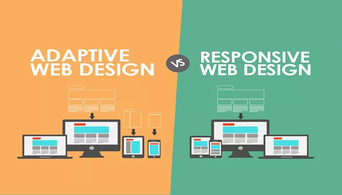
In the realm of web design, two prominent approaches have emerged to ensure websites display optimally across various devices and screen sizes: adaptive design and responsive design. This comprehensive guide explores the differences between these two methodologies, their benefits, challenges, and how each can impact user experience and website performance.
Introduction to Web Design Principles
Before delving into adaptive and responsive design, it’s crucial to understand the foundational principles of web design and the evolution of user experience expectations in the digital age. Websites are no longer static entities but dynamic platforms that need to adapt seamlessly to different devices, resolutions, and user interactions.
What is Adaptive Web Design?
Adaptive web design (AWD) involves creating multiple fixed layout sizes for different devices and delivering the appropriate layout based on the device’s screen size, resolution, and capabilities. Here’s a detailed look at how adaptive design works:
Fixed Layout Breakpoints:
Designers define specific breakpoints where the layout of the website changes to accommodate different screen sizes (e.g., desktop, tablet, mobile).
Each breakpoint corresponds to a predefined layout optimized for that particular screen size.
Server-Side Detection:
Adaptive design detects the user’s device server-side and serves the corresponding pre-designed layout.
This approach prioritizes specific device categories and tailors the user experience accordingly.
See also:Graphic Design Vs. Web Design: Which Is Better
Pros of Adaptive Design:
Performance Optimization: Since layouts are fixed, adaptive designs often load faster because only necessary resources are fetched based on device detection.
Tailored User Experience: Designers have precise control over how content is presented on different devices, ensuring a consistent and optimized experience.
Cons of Adaptive Design:
Limited Flexibility: Creating multiple layouts increases development time and maintenance efforts.
Device Fragmentation: With an ever-expanding array of devices, maintaining compatibility across all screen sizes and resolutions becomes challenging.
What is Responsive Web Design?
Responsive web design (RWD) is a fluid and flexible approach to web design that focuses on building a single website that automatically adjusts its layout and content to fit the screen size and orientation of any device. Here’s how responsive design operates:
Fluid Grid Layouts:
Websites built with responsive design use fluid grid layouts based on percentages rather than fixed pixels.
Content elements resize proportionally based on the viewport size, ensuring consistency and readability across devices.
CSS Media Queries:
Responsive design utilizes CSS media queries to apply different styles based on the device’s screen width.
This allows for a seamless transition between various screen sizes without the need for separate layouts.
Viewport Meta Tag:
The viewport meta tag is crucial in responsive design as it instructs the browser how to control the page’s dimensions and scaling on different devices.
It ensures that websites are displayed correctly and are fully responsive on mobile devices.
Pros of Responsive Design:
Unified User Experience: A single design adapts to all devices, providing a consistent user experience across desktops, tablets, and smartphones.
SEO Benefits: Google recommends responsive design as it simplifies website management and improves SEO by consolidating backlinks to a single site URL.
Cons of Responsive Design:
Complexity in Implementation: Designers need a deep understanding of CSS, HTML, and responsive frameworks to ensure effective implementation.
Potential Performance Overhead: Responsive sites may load slower if not optimized properly, impacting user experience and SEO rankings.
Key Differences Between Adaptive and Responsive Design
Approach to Layouts:
Adaptive Design: Uses multiple fixed layouts tailored to specific device categories.
Responsive Design: Utilizes fluid grids and CSS media queries to adapt content dynamically across all screen sizes.
Flexibility vs. Control:
Adaptive Design: Offers precise control over how content is presented on different devices but can be rigid and less adaptable to new devices.
Responsive Design: Provides flexibility and scalability across a wide range of devices but may require more initial planning and development effort.
Performance Considerations:
Adaptive Design: Can be more efficient in terms of performance due to serving optimized layouts based on device detection.
Responsive Design: Requires careful optimization to ensure fast loading times and smooth performance across devices.
Choosing the Right Approach for Your Website
Consider Your Audience:
Analyze your target audience’s device preferences and behaviors to determine whether adaptive or responsive design aligns better with their needs.
Evaluate Content and Design Requirements:
Assess the complexity of your website’s content and design elements to decide which approach offers the best balance between control and flexibility.
Budget and Resource Allocation:
Factor in development costs, maintenance efforts, and ongoing support when choosing between adaptive and responsive design.
Conclusion
In conclusion, both adaptive and responsive web design methodologies aim to enhance user experience by ensuring websites are accessible and functional across diverse devices. While adaptive design provides granular control over specific device categories, responsive design offers scalability and flexibility for a seamless experience across all screen sizes. By understanding the differences outlined in this guide and evaluating your website’s unique requirements, you can make an informed decision to optimize your web presence effectively. Whether you prioritize precise layout control or universal accessibility, the choice between adaptive and responsive design shapes how users interact with your website and perceive your brand in the digital landscape.
Related topics:
- Atom63.Io By You Zhang Triumphs With Iron A’ Design Award In Website And Web Design Category
- Distributing Hostinger Webmail: A Comprehensive Guide
- Guide On How To Cancel A PayPal Payment

